
In today’s digital world, having a professional and user-friendly website is not just an option for medical practices—it’s a must. Your clinic’s website is often the first point of contact with potential patients, and a well-designed website can make all the difference in growing your practice and building trust.
The demand for quality health and medical information highlights the need for intuitive and informative websites. According to a recent Malaysian Communications and Multimedia Commission study, nearly 90% of all internet users in Malaysia have searched for medical and health information online:
”There are 86.9% of internet users relying on the Internet to look for information, majority of them (77.2%) did look for health information online. The most common health related information that users were seeking were on ‘symptoms and diseases’ (91.4%), followed by ‘health care tips’ (89.8%) and “treatment method” (83.5%). Over half of them were looking for “medications/drugs information” (73.7%), as well as “place to get treatment”.
In healthcare, websites must overcome several challenges to stand out in the marketplace and deliver an optimized user experience, including:
Despite these challenges, many successful healthcare organizations stand out with websites that follow best practices for healthcare website design.
Here, we review 10 of the best website design examples, showcasing how each clinic used strategic web design to enhance user experience, grow their brand, and attract more patients.
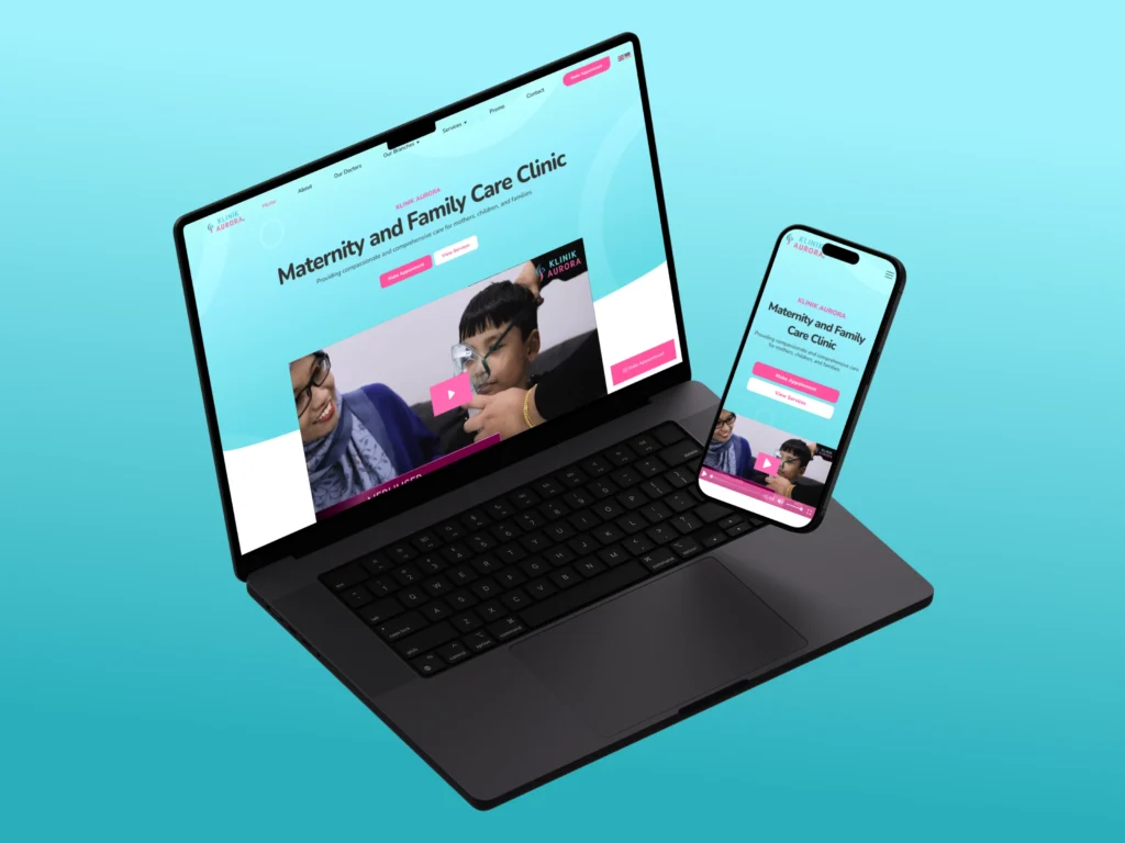
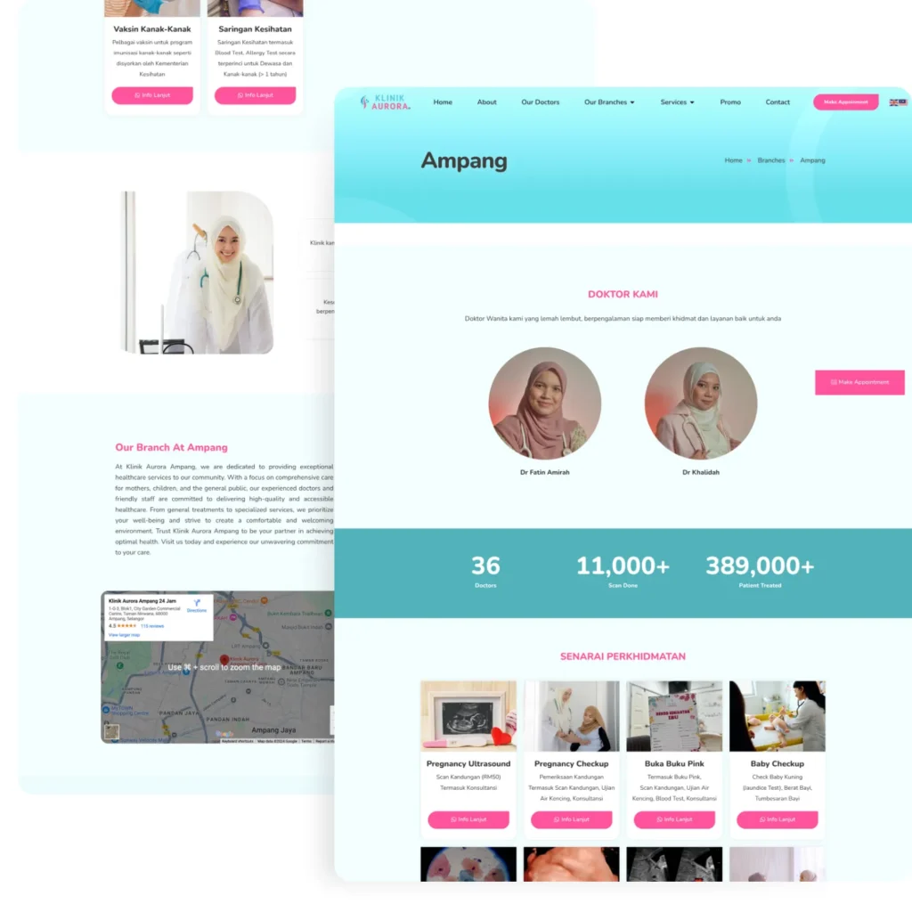
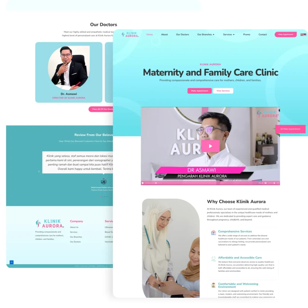
Klinik Aurora exemplifies how a modern medical website design can captivate visitors. To showcase their expertise in women’s and children’s healthcare, we developed their website with soft touches and colors that align with their brand guidelines.
The clean, responsive design and intuitive navigation allow patients to easily book appointments through Yezza integration, access information about their nearly 30 branches, and read informative service pages.
By hosting all branches under a single website, Klinik Aurora eliminates the need for separate sites, reducing management costs.
The site also incorporates SEO strategies to ensure high rankings in search engines, attracting more patients online.
In summary, Klinik Aurora’s website has proven to be a significant asset in enhancing their brand and online presence.
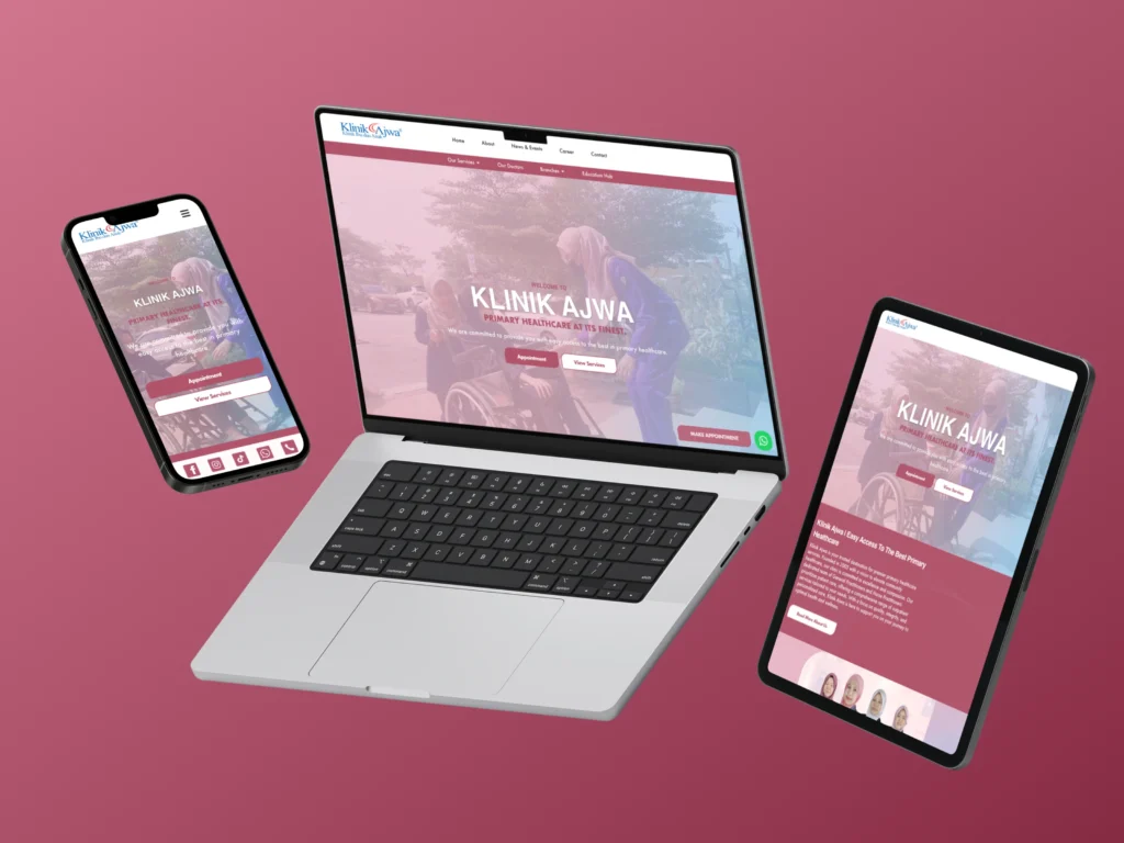
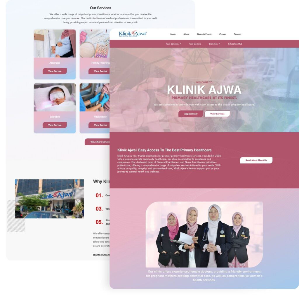
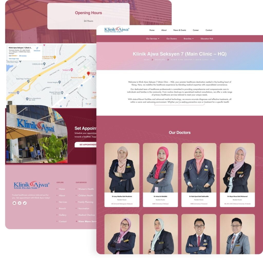
Klinik Ajwa boasts a sleek and professional design that reflects their high-quality care. The homepage greets visitors with a well-branded video and clear messaging about their specialty in women’s and children’s healthcare.
Each doctor has their own profile, enhancing their visibility in Google searches.
We’ve improved user experience with an easy-to-use appointment booking system and clear service descriptions. With seven branches united under one website, Klinik Ajwa ensures consistent messaging and branding across all locations.
Located in Shah Alam, Klinik Ajwa has achieved top rankings in local Google searches, driving a steady stream of organic traffic to their website. This increased exposure attracts patients naturally, boosting awareness of their clinic.
Ultimately, Klinik Ajwa’s website serves as a powerful tool for their online awareness campaign, effectively promoting their clinic without relying on paid advertising.
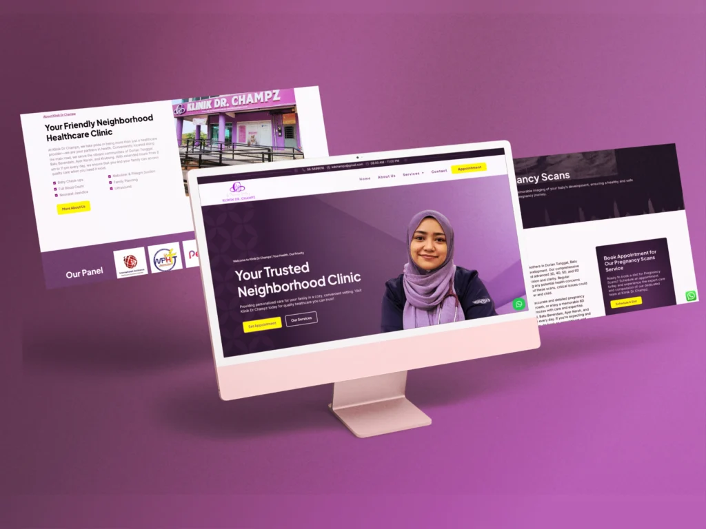
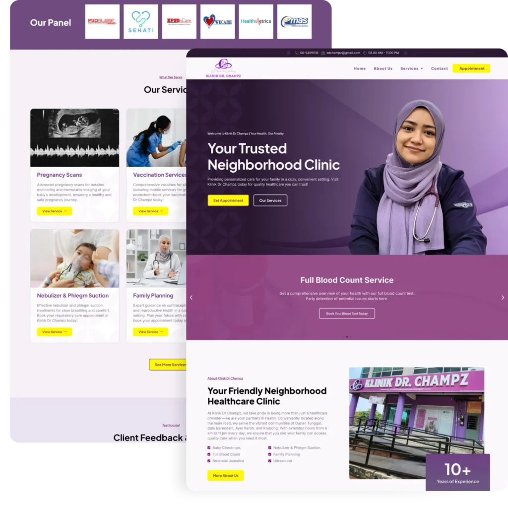
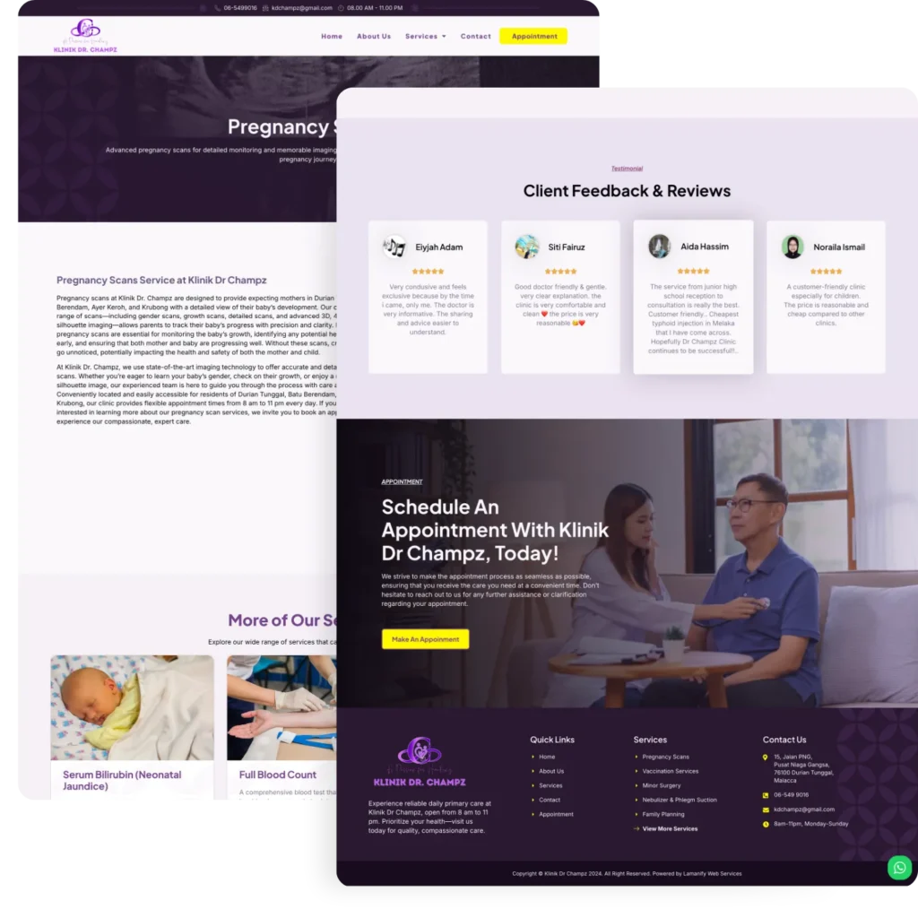
Klinik Dr. Champz in Durian Tunggal, Melaka, needed a strong online presence to compete with other local clinics. With 10–15 clinics in Durian Tunggal and over 30 in the nearby Batu Berendam and Ayer Keroh areas, standing out was crucial.
Recognizing this competitive landscape, we took extra steps to enhance their brand positioning and optimize their website for Google search results.
Through advanced SEO implementation, we successfully targeted high-value keywords such as “baby scan Durian Tunggal,” “pregnancy scan Durian Tunggal,” and “clinic Durian Tunggal” within weeks of launching.
Our SEO strategy complemented—rather than compromised—the design. We applied best practices in medical web design to ensure the target audience could easily understand the website’s content.
We delivered a responsive, SEO-friendly website that not only showcases their services but also connects patients through a built-in appointment scheduling tool.
The simple, clean layout enhances patient interaction and boosts site engagement.
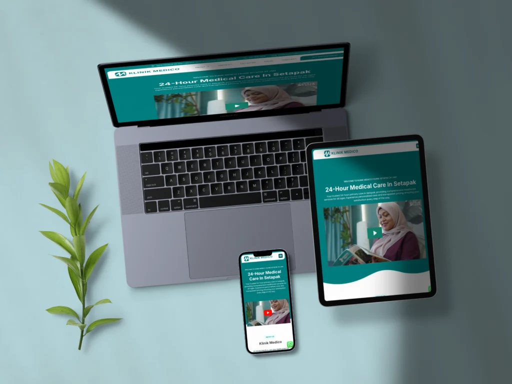
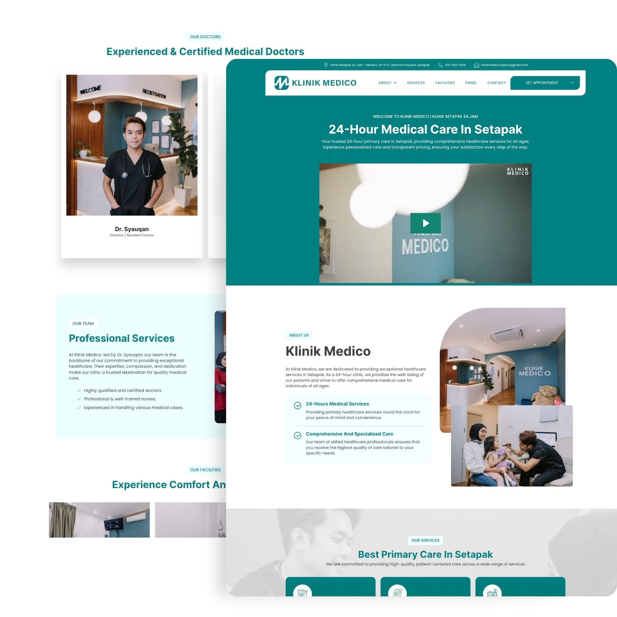
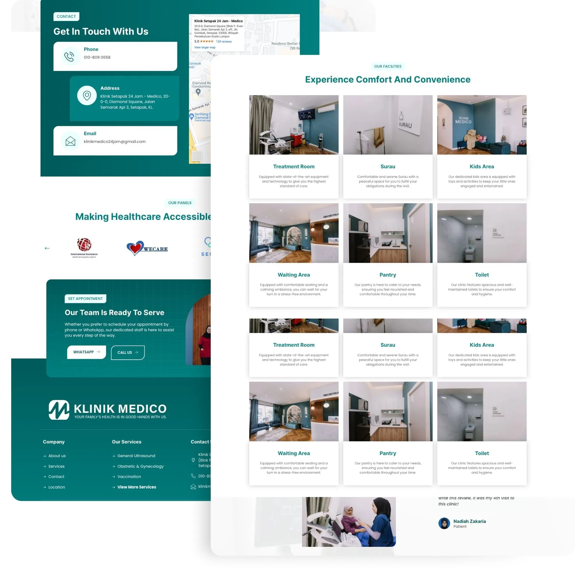
Klinik Medico, serving a competitive demographic in the Setapak area, approached us to enhance their online visibility on Google. Dr. Syauqan, representing Klinik Medico, requested an informative website that would showcase all their services and highlight the clinic’s interior design.
Their primary objective was to ensure patients clearly understood their offerings while capturing attention with their aesthetically pleasing clinic environment.
In response, we developed an accessible, mobile-friendly website that follows best medical web design practices. The Lamanify team crafted nearly 90% of the copy, effectively capturing the clinic’s unique brand identity and specialized services.
The resulting website enables patients to swiftly locate needed services and schedule appointments, significantly boosting Klinik Medico’s patient acquisition and retention rates.
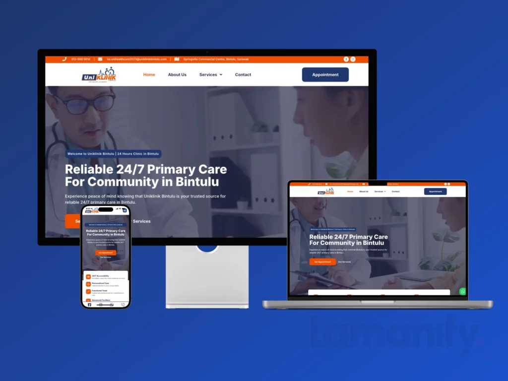
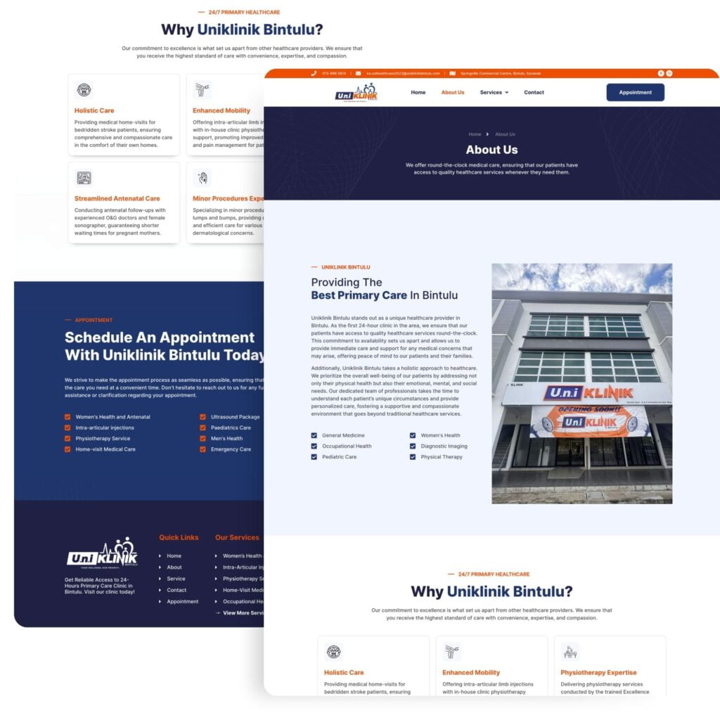
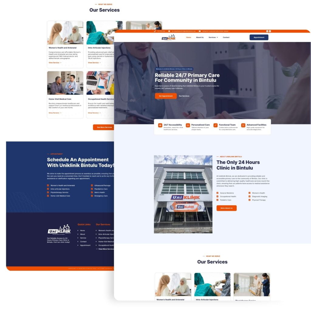
U.N.I Klinik Bintulu approached us seeking a website to strengthen their local presence. Interestingly, when they contacted us, the clinic wasn’t even operational yet. However, they were determined to have a website that would capture the “24-hour clinic in Bintulu” market, so we proceeded with the project.
We crafted a site that’s not only visually appealing but also optimized to rank for local SEO keywords. The branding guidelines strictly adhered to U.N.I Klinik’s brand identity, featuring a blend of orange and dark blue. We combined these colors with white and black throughout the website to ensure consistency with the provided guidelines.
As one of the first 24-hour clinics in Bintulu, they aimed to capture the market with a website optimized for Google search rankings. Following best medical web design practices, we structured the site to ensure a well-thought-out layout that’s easy for patients to read while remaining accessible for Google’s crawlers.
The result? This clinic’s website now stands out in search results, making it easier for potential patients to find and book their services.
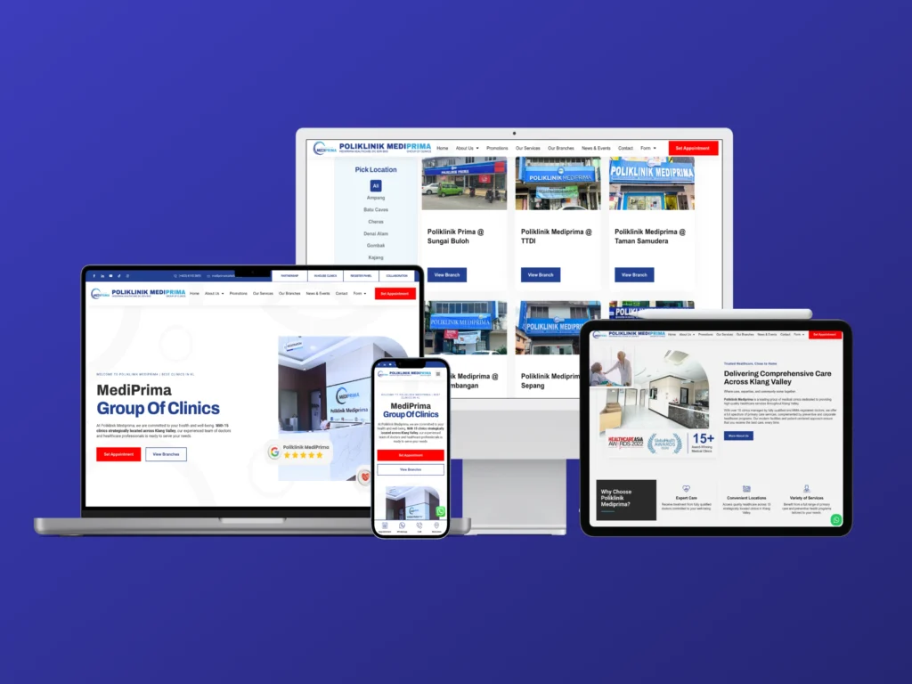
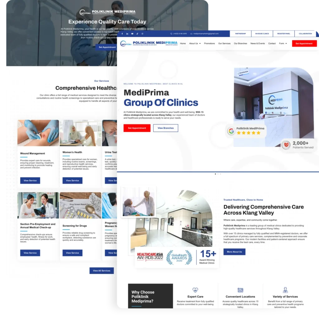
Poliklinik MediPrima required a robust digital strategy to compete in multiple locations across the Klang Valley area. With 18 clinics to date, Poliklinik MediPrima needed a fully functional website to serve each branch and maintain their online presence.
The design concept for this website leans towards a corporate and professional look while maintaining ample white space to preserve its minimalist aesthetic and ensure effortless reading.
The strategic growth plan aimed to ensure each branch could capture local search traffic. At Lamanify, a part from delivering the best medical web design practices, we implemented an advanced SEO strategy to increase impressions for their branches within their respective local areas.
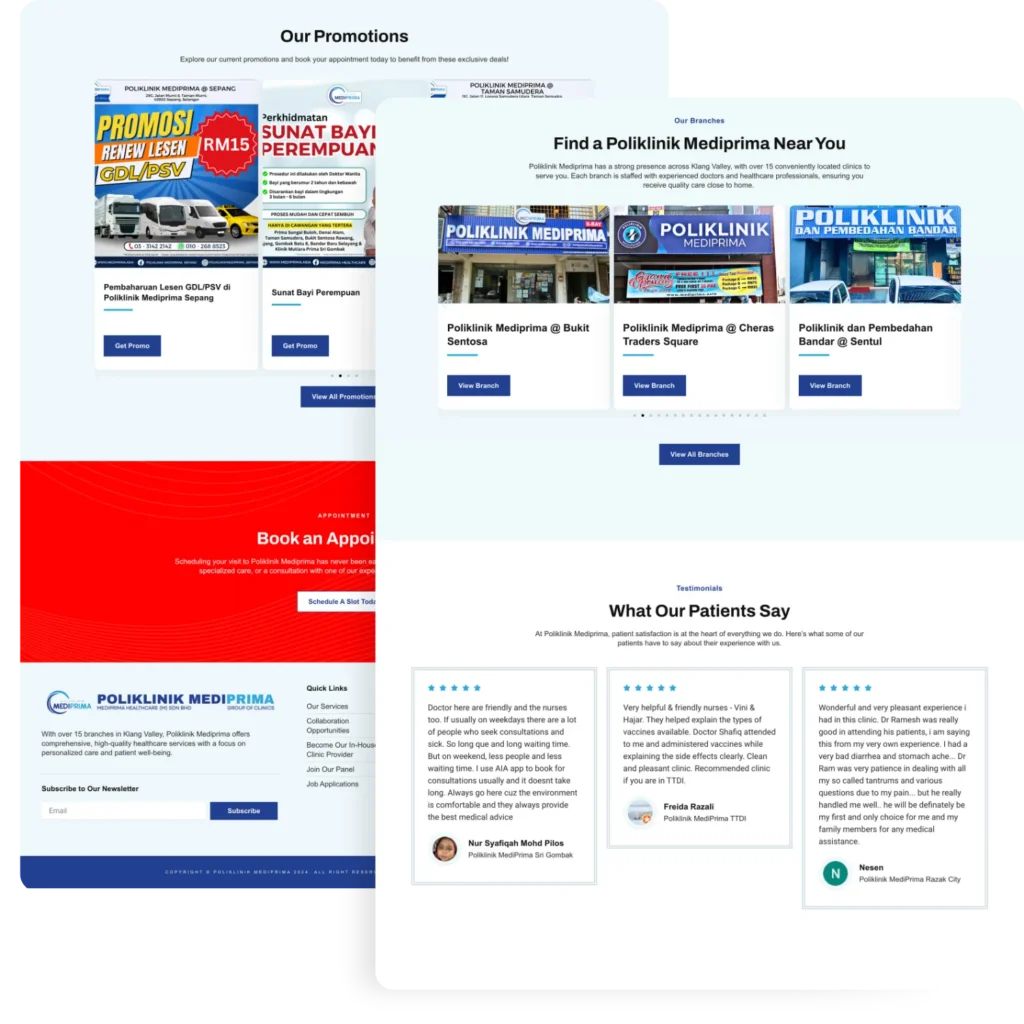
They also requested multiple forms to cater to vendors, partners, and patients’ requests for various services. This approach allows them to separate and categorize each request according to specific needs.
The website also manages appointments and collects patient feedback, enabling continuous service improvement.
We designed a dynamic, multi-functional website that showcases their range of services and locations.
The site’s responsive design and SEO strategy ensure high rankings on Google, driving more traffic and patient inquiries.
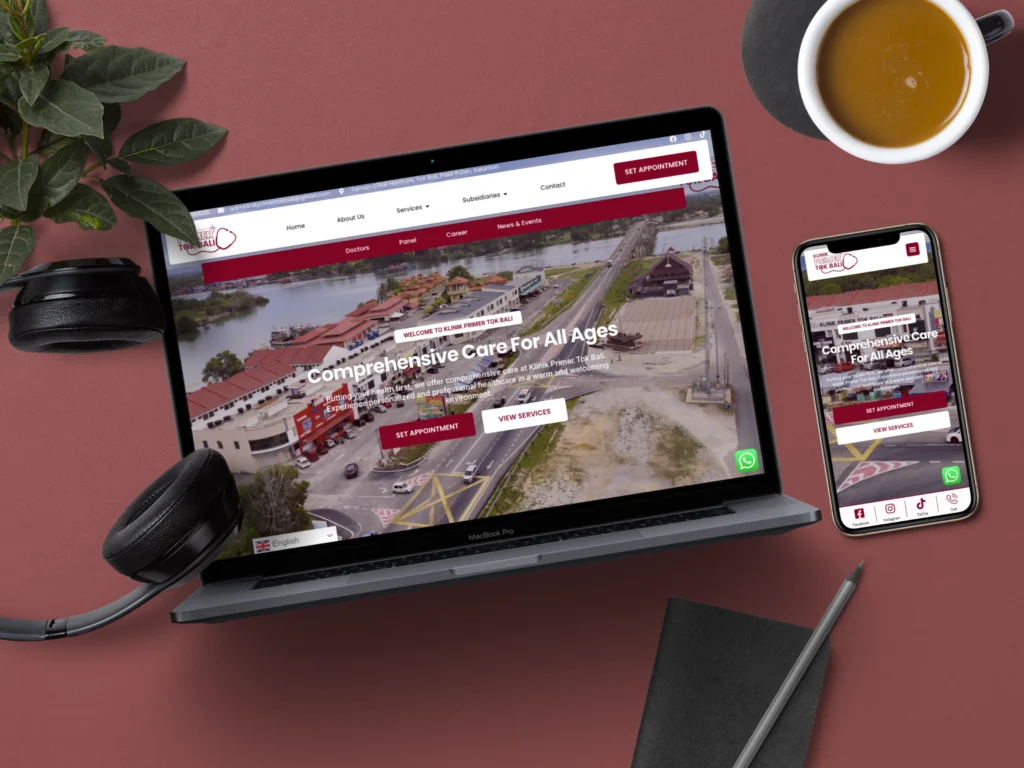
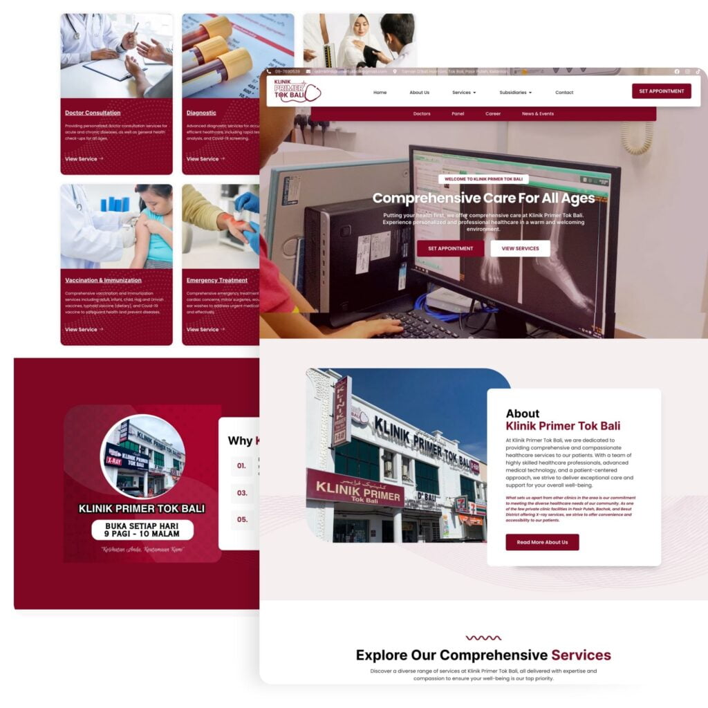
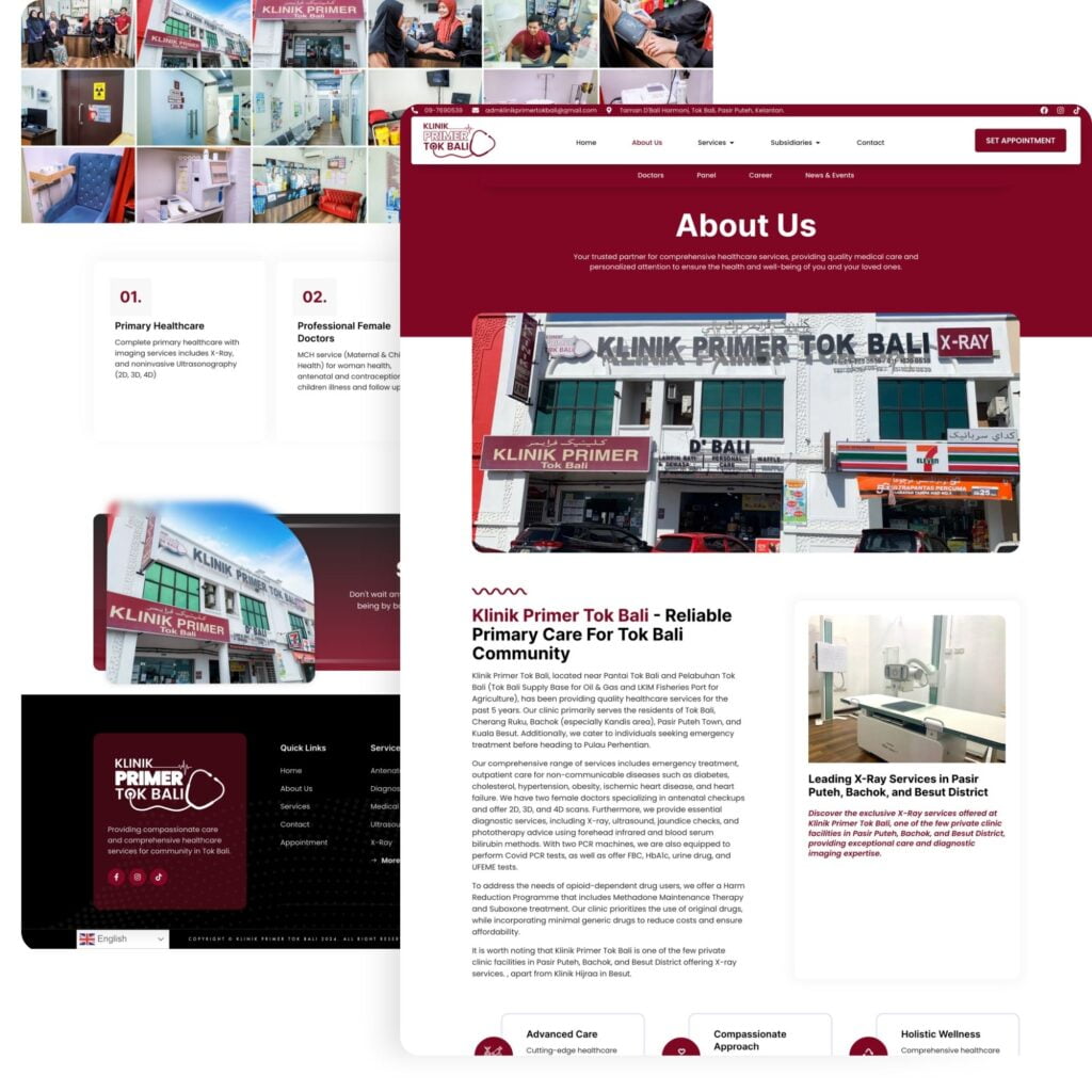
Klinik Primer Tok Bali, a primary healthcare provider situated in the picturesque coastal town of Tok Bali, Kelantan, approached us with a clear objective: to enhance their digital presence and reach a wider audience in their local community. Recognizing the importance of a strong online footprint in today’s healthcare landscape, they sought our expertise to create a website that would not only showcase their services but also resonate with their target demographic.
Our design team embraced the challenge, crafting a medical website design that seamlessly blends modern aesthetics with corporate professionalism. The design concept carefully balances the clinic’s need for a contemporary look with the trustworthiness expected of a healthcare provider. Despite the abundance of information the clinic wished to convey, we meticulously structured the content to prevent information overload, ensuring that visitors can easily navigate and appreciate the website’s professional design without feeling overwhelmed.
The color palette we chose plays a crucial role in the website’s visual appeal and brand identity. By artfully combining red, black, and white, we created a striking visual harmony that not only captures attention but also effectively highlights Klinik Primer Tok Bali’s brand colors. This thoughtful color scheme extends beyond the website, serving as a unifying element across all of the clinic’s business ventures, reinforcing brand recognition and consistency.
In crafting the website, we prioritized simplicity and elegance without compromising on functionality. The result is a user-friendly platform that effectively showcases the clinic’s comprehensive medical services while providing patients with intuitive navigation and easy access to contact information. This approach ensures that potential patients can quickly find the information they need, enhancing the overall user experience and potentially increasing engagement rates.
Understanding the importance of local visibility in the digital age, we implemented robust SEO strategies tailored to Klinik Primer Tok Bali’s specific needs. Our team carefully optimized the content to target relevant keywords for their local area, ensuring that the clinic ranks prominently in search results for healthcare services in Tok Bali and surrounding regions. This SEO-focused approach not only improves the clinic’s online visibility but also helps them connect more effectively with their target audience, potentially driving more foot traffic to their physical location.
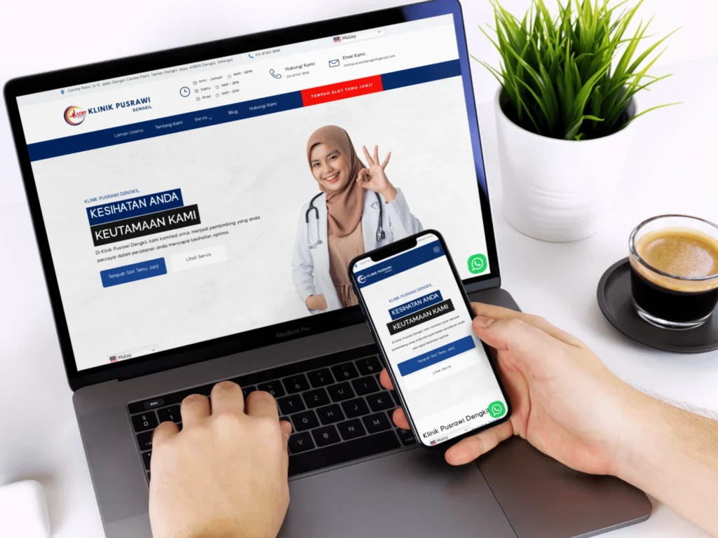
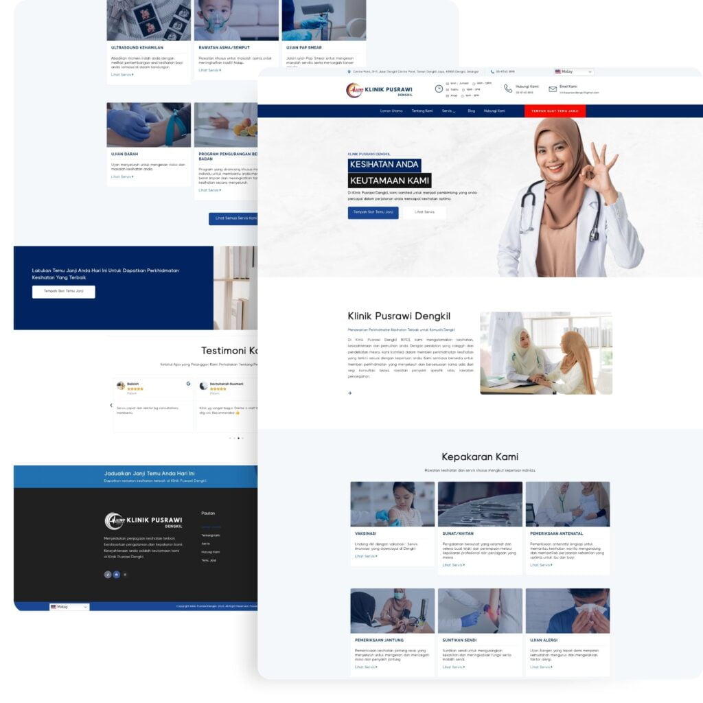
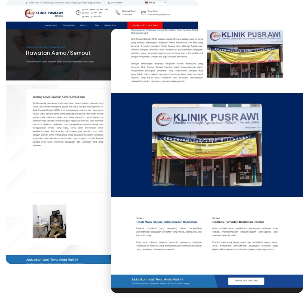
Klinik Pusrawi Dengkil boasts an extensive range of medical services, and their website was meticulously designed to showcase this comprehensive offering. Recognizing the predominantly Malay-speaking local demographic, we developed the entire website in Bahasa Melayu, ensuring optimal accessibility and relevance for their target audience.
Our team adhered to the highest standards of medical website design SOP, implementing best practices and standard operating procedures throughout the development process. A key feature of the site is its seamlessly integrated appointment booking system, allowing patients to schedule consultations directly through an intuitive online form. This streamlined approach significantly enhances patient engagement and simplifies the appointment process.
From a design perspective, we prioritized user experience and information flow. The website’s architecture was carefully crafted to guide visitors effortlessly through the clinic’s services and facilities. We opted for a clean, minimalist color scheme dominated by white and blue tones. This deliberate choice serves multiple purposes: it creates a sense of spaciousness, allowing the content to breathe; it enhances readability, making information consumption effortless for patients; and it evokes a sense of trust and professionalism associated with healthcare services.
The strategic use of white space throughout the design is more than just an aesthetic choice. It plays a crucial role in organizing content, reducing visual clutter, and directing the user’s attention to key information. This approach ensures that the website remains visually appealing without compromising on the depth and clarity of the information presented.
In addition to its aesthetic and functional merits, we developed the website with a strong focus on technical performance and search engine optimization. The result is a responsive, SEO-friendly platform that adapts seamlessly to various devices and screen sizes. We created optimized landing pages for each of Klinik Pusrawi Dengkil’s services, significantly boosting their online visibility. This targeted approach to SEO has markedly improved the clinic’s search engine rankings, making it easier for potential patients to discover and engage with their services online.
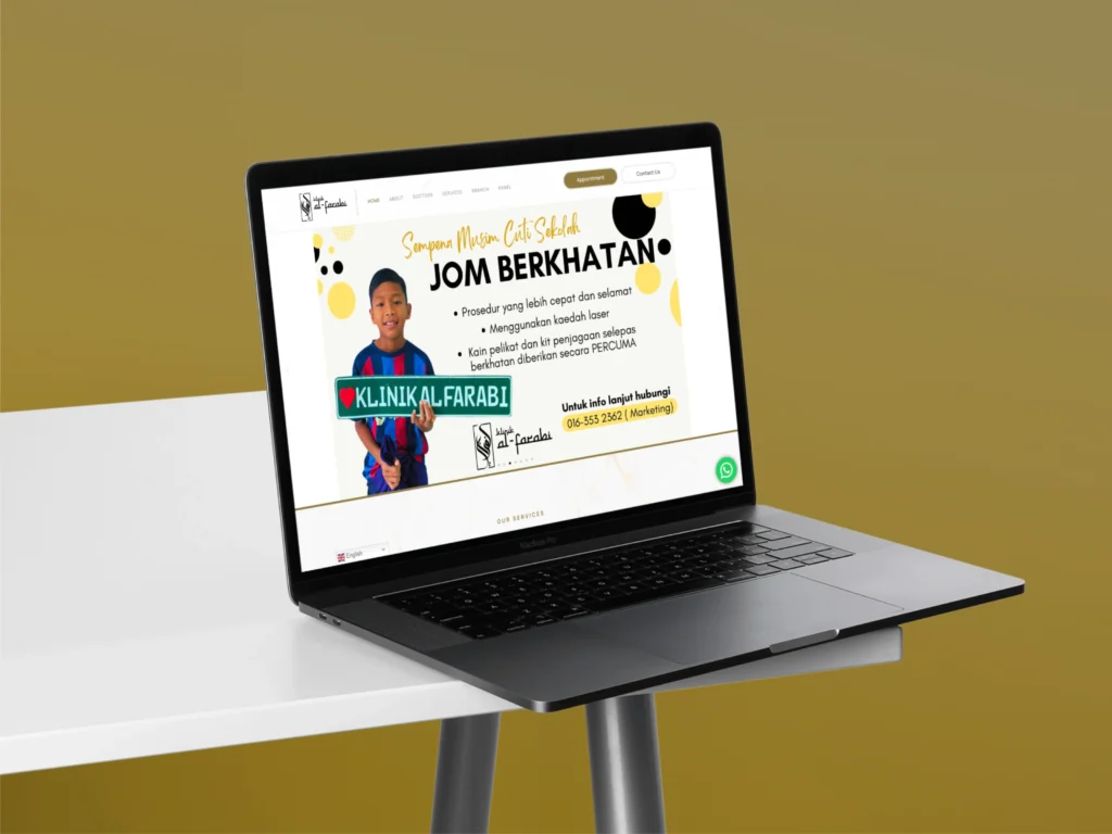
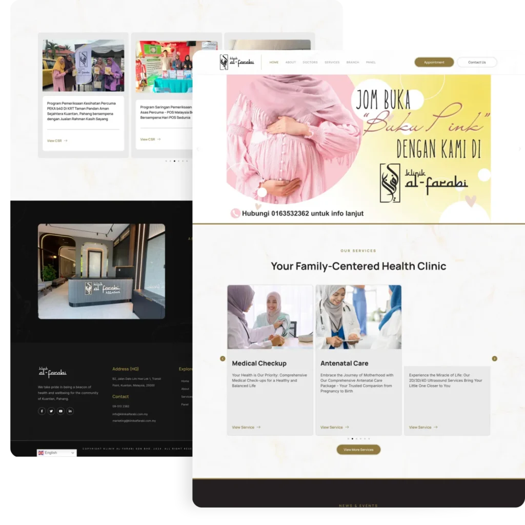
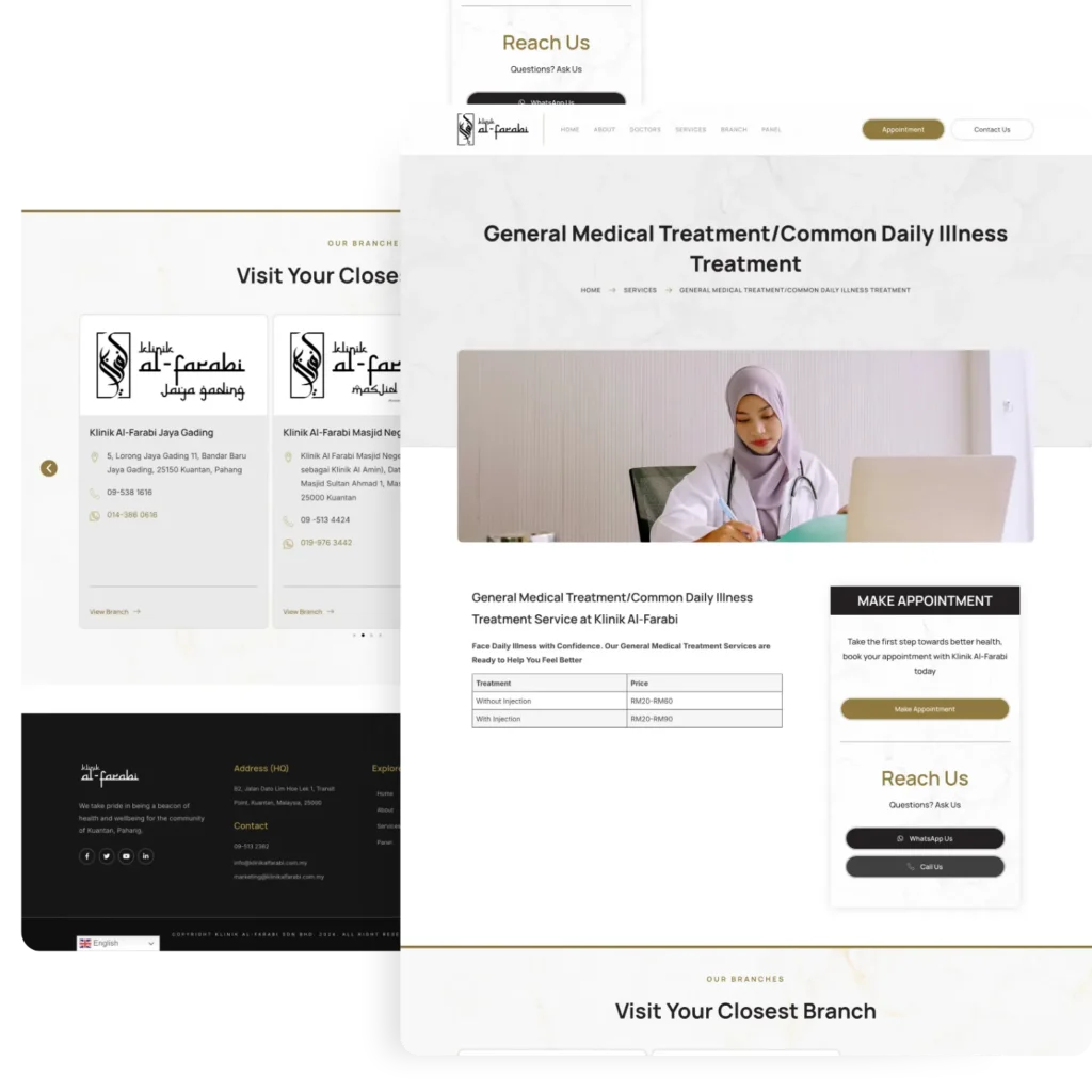
Klinik Al-Farabi, a prominent healthcare provider in Kuantan, Pahang, sought a comprehensive digital solution to showcase their specialized medical services and enhance patient engagement. Recognizing the importance of a strong online presence in today’s competitive healthcare landscape, the clinic partnered with us to develop a website that would not only highlight their expertise but also provide an intuitive and informative platform for their diverse patient base.
With multiple branches scattered throughout Kuantan, Klinik Al-Farabi’s management emphasized the need for a centralized digital hub. They envisioned a website that would serve as a virtual gateway, offering seamless access to information about each clinic location. This approach aimed to streamline patient experience and improve accessibility, allowing visitors to easily find and connect with the most convenient branch for their healthcare needs.
To further enhance patient convenience and streamline operational efficiency, we integrated the website with KumoDent, a sophisticated clinic management system. This integration enables a seamless appointment booking process, allowing patients to schedule consultations directly through the website. By eliminating barriers between online discovery and in-person visits, this feature significantly improves the patient journey and potentially increases appointment conversions.
A key objective for Klinik Al-Farabi was to establish a strong, professional brand presence in the digital sphere. Understanding that many potential patients begin their healthcare provider search online, we prioritized creating a website that would effectively represent the clinic’s values, expertise, and commitment to patient care. This focus on branding extends beyond mere aesthetics, aiming to build trust and credibility with visitors from their very first interaction with the clinic online.
In designing and developing the website, we adhered to best practices in user experience (UX) design and search engine optimization (SEO). The result is a website that not only looks polished and professional but also performs exceptionally well. Key features include:
Through this comprehensive approach to web design and development, we’ve created a digital platform for Klinik Al-Farabi that not only meets their immediate needs but also positions them for future growth. By combining attractive design, user-friendly functionality, and strategic SEO implementation, the website serves as a powerful tool for attracting new patients, enhancing engagement with existing ones, and ultimately driving growth for the clinic.
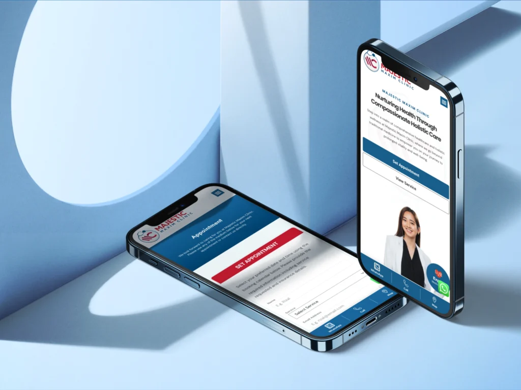
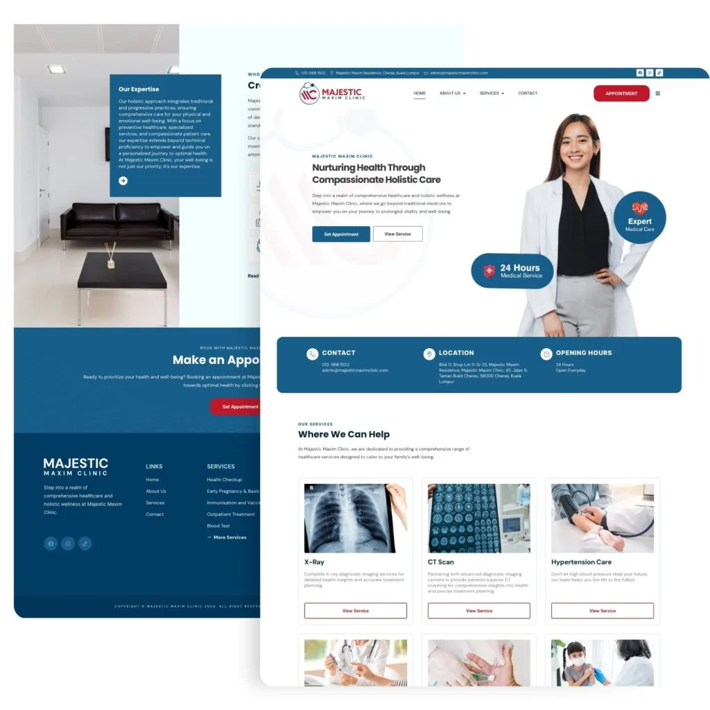
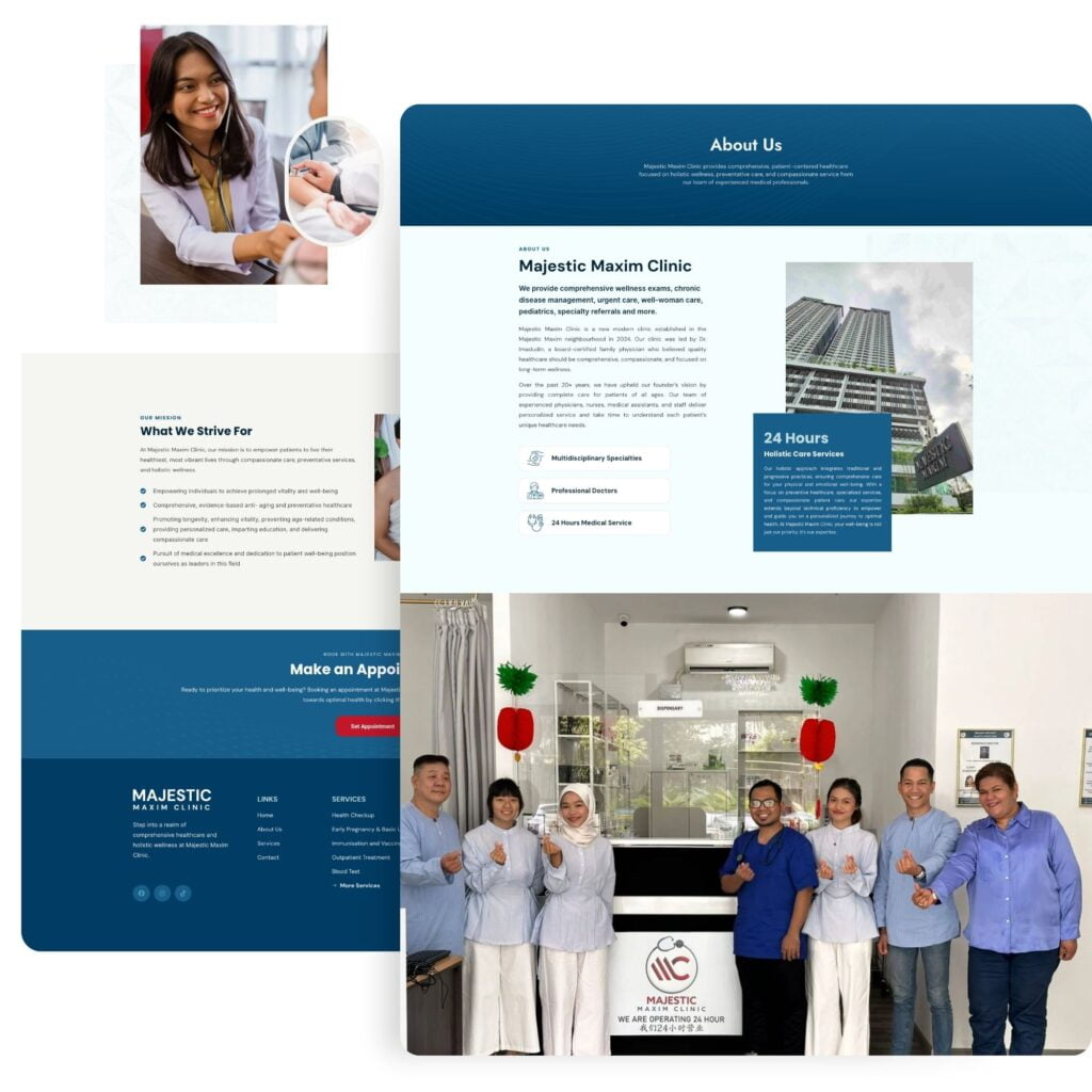
Majestic Maxim Clinic, situated in the bustling area of Cheras, approached us with a clear vision for their online presence. Their goal was to create a website that would not only attract more local patients but also effectively showcase their medical expertise and range of services. Interestingly, the clinic engaged our services even before their physical doors were open, demonstrating their proactive approach to establishing a strong digital footprint from the very beginning.
Understanding the clinic’s aspirations and target market, we embarked on a collaborative journey to develop a medical website design that would resonate with the local community, particularly focusing on the Majestic Maxim residential area. Our team crafted multiple strategic approaches, each designed to capture the essence of the clinic’s offerings while appealing to the specific needs and preferences of potential patients in Cheras.
The result of our efforts was a modern, sleek website design that perfectly balanced aesthetics with functionality. We incorporated ample white space throughout the layout, a design choice that not only enhanced the visual appeal but also significantly improved readability. This approach ensures that visitors can easily navigate the site and absorb important information about the clinic’s services without feeling overwhelmed.
Beyond its visual appeal, we prioritized the website’s performance in search engines. Our team implemented robust SEO strategies, carefully optimizing the site to rank well for targeted keywords relevant to the clinic’s services and location. This SEO-focused approach ensures that when potential patients in Cheras search for medical services online, Majestic Maxim Clinic appears prominently in their search results.
The website we created goes beyond being a mere online brochure. It serves as a powerful tool for patient engagement and conversion. We integrated clear, actionable information throughout the site, guiding visitors towards making appointments. By streamlining this process, we’ve effectively designed the website to convert casual browsers into actual patients, thereby contributing to the clinic’s revenue growth and establishing a strong foundation for their business in the competitive healthcare market of Cheras.
The medical industry is becoming more competitive, and clinics without a strong online presence are missing out on potential patients.
At Lamanify, we specialize in best medical web design that not only looks great but also performs well in search engines.
Whether you need a complete redesign or are starting from scratch, we can help you create a website that attracts more patients and grows your clinic’s brand.
Ready to take your clinic’s online presence to the next level? Contact us today to discuss how we can help build a powerful, SEO-optimized website for your clinic.
