Do you know that responsive web design optimization is almost mandatory for any web design project?
With an astronomical 6.7 billion smartphone users globally as we step into 2023 – a figure set to climb to a staggering 7.6 billion by 2027 – the digital landscape is changing rapidly.
The plethora of devices, each with diverse screen sizes, creates a challenge for website designers to design a universally user-friendly interface.
So, the question is, how can we craft responsive websites that provide a seamless experience across different screen sizes? Let’s break this down.
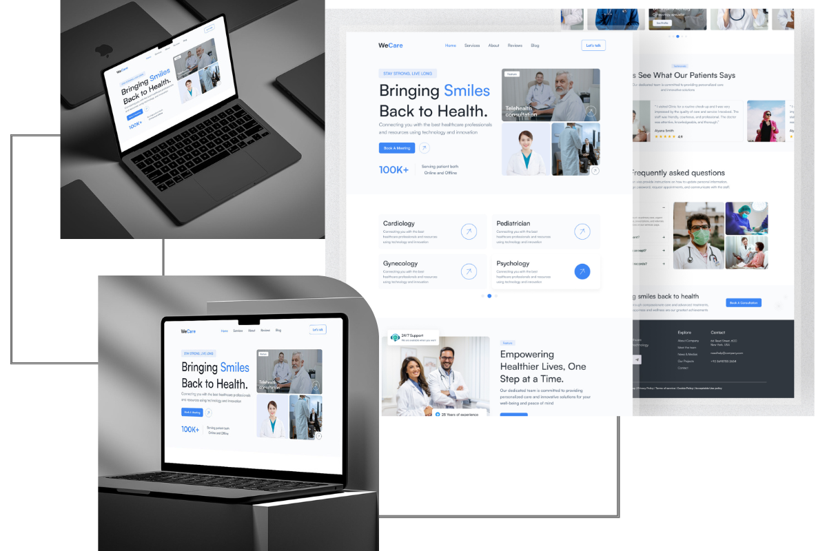
Responsive web design is the advanced design strategy that ensures consistently excellent usability across multiple devices – mobile, tablet, or desktop. Without responsive design, a significant 80% of users would rather skip your website than contend with an inadequate user experience.
To drive the point home, Google also factors in mobile-friendliness as a significant ranking determinant.
As per Google Webmaster Central Blog, “Starting April 21 (2015), our search ranking will prioritize mobile-friendly sites to help users discover optimized results on their devices.”
This significant update made by Google to its search engine algorithm, known as “Mobilegeddon,” was implemented on April 21, 2015.
The change was announced on Google’s Official Webmaster Central Blog, and its aim was to prioritize the use of mobile-friendly design in websites when ranking search results. The update has come to emphasize the necessity of having a mobile-friendly or responsive web design.
The change has since evolved into the concept of mobile-first indexing, where Google predominantly uses the mobile version of the content for indexing and ranking.
In 2020, Google announced it would be switching to mobile-first indexing for all websites starting from September 2020, providing users with better quality content, irrespective of the device they use. This announcement can be found on Google’s Webmaster Central Blog.

To grasp why responsive design is so critical for a website’s success, one needs to recognize the enormous diversity in device screen sizes. The plethora of available resolutions further complicates the tasks of developers and designers.
These values reflect the diversity in screen sizes you’re catering to when creating a mobile responsive design. Do note that certain smaller screen sizes, like 393 *373, have seen a downward trend recently. But they continue to hold relevance due to a significant section of users utilizing these resolutions. This data on screen resolutions can be found on websites like StatCounter.
Based on the Worldwide Screen Resolution Stats (Sept 2021 – Sept 2022), the screen sizes holding sway across mobile, desktop, and tablet are:
To validate your website’s responsiveness, perform a real-time test on actual devices. Also, remember to consider the still significant usage of desktop devices as shown in the chart below.
Microsoft’s documentation offers useful guidance by recommending a few primary width categories or “breakpoints.“ These breakpoints can be found in Microsoft’s documentation.
However, remember that there’s no absolute one size fits all in web design. A successful design balances these primary dimensions with the specific needs and device tendencies of its target audience.
Designing for multiple screen sizes becomes more manageable with these strategies:
This shift towards a mobile-first design isn’t just about aesthetics; it’s a practical approach to create a more efficient and engaging user experience. From highlighting primary CTAs to prioritizing key menu options, the focus is on optimized usability, especially for smaller screens.
Implementing a responsive design might seem complex, but the guidelines mentioned here aim to simplify the process. By incorporating these practices, you can create a resourceful website that satiates your audience, irrespective of their chosen device to access your site.
If you are in need of professional web design services to create a responsive design for your website, please do not hesitate to contact Lamanify for assistance.
Our expertise will ensure that your website remains user-friendly and optimized for all devices, providing the best possible experience for your audience.


